Saturday, February 27, 2010

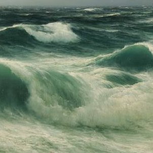
Jensen M?

27 x 41 (inches?)
A horizon line located in the middle of the image, dividing it in two equal halves, can produce an uncomfortable duality, especially if it's dead straight. In this work the seabirds and white wavecrests, though insignificant in terms of the painting area, provide a unifying third element. Of course, there may be instances where a painter wants to create an unnerving, unresolved visual tension in a painting.
I posted this work because of the rich emerald and jade hues in the waves, and the fine brushwork. It came from an auction website with very little info.

Bruce Mulcahy - British

The palette of British seascapes is much colder than the Australian example in the previous post.

Friday, February 26, 2010

Frederick W Leist - Australian

Morning Bathers (detail) c. 1928

Our first instinct is to use only cool colours for water. But the reflective surface of the sea can mirror the warm tones of a hot summer day. Introducing warm tones into the water unifies this image.

Wednesday, February 24, 2010

Montague Dawson - British

The Sea Alone
The well-known maritime artist Montague Dawson (1895 – 1973) was never afraid to put dark tones in his waves. He was patronised by the British Royal Family and US presidents. His work was influenced by Charles Napier Hemy.

Tuesday, February 23, 2010

James Guppy - Australian

Nailing Down the Surf, Acrylic on linen, 45 x 91 cm

The Australian painter James Guppy is carrying on the Surrealist tradition of Magritte and Dali. I'm not a big fan of the Surrealists but when the dream-like element is subtle, as in this work, it works for me. Guppy shares my fascination with the technical achievements of the 18th and 19th century painters.

Sunday, February 21, 2010

Dennis Doheny

Opalescence, 24 x 24 inches
(Winner of the Edgar Payne Landscape prize 2009)


From the wonderful blog underpaintings

Guy Rose - American

Point Lobos - 1918

Friday, February 19, 2010

William Dodds - Australian

40 x 50 cm


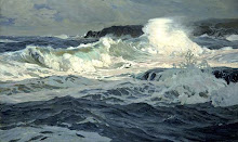
The backdrop of the void sky (perhaps a dark curtain of rain offshore), and the stage-like beach, highlight the drama of the collision of rock and wave. Seascape artists often darken and simplify skies in order to put the waves in the limelight. Similarly, in still life painting, a plain, low key, neutral background is generally used to bring out the subject. Here, the surf has been given an almost mystical quality.

Thursday, February 18, 2010

Monochrome

Jennifer Day,
oil on panel,
36 x 48 inches


Monochrome studies allow you to concentrate on tone and detail without the distraction of colour. An old master oil paining technique is to start with a monochrome underpainting and then (after waiting for it to dry) add glazes of colour. It requires patience, but gives the painting depth, purity and richness. A monochrome underpainting need not be black and white or grey scale. Warm, earth tones were the most used for underpainting by the old masters, although cooler hues, would be better for watery subjects. It's advisable to use a pigment that dries relatively quickly.
The artist has chosen to use panel for the support. A smooth support can be more suitable than canvas for the subtle detail in the clouds and waves (unless working on a very large scale).

Wednesday, February 17, 2010

Highlights

Terrick Williams,
The Cornish Coast,
16 x 20 inches


The touches of sunlight on the rocks take only a few moments to add (usually last) but go along way towards bringing a scene to life.
See also the dots of lights on the waves in the post below, and imagine the painting without them.

Terrick Williams (20 July 1860 – 20 July 1936) was a British painter and a member of the Royal Academy. During his lifetime, Williams became one of the most successful painters in London.

Monday, February 15, 2010

Ray Roberts - American


Some plein air studies focussing on the movement of waves around rocks.

Sunday, February 14, 2010

Alfred T Bricher - American

Along the Shore
12 x 25 inches


Bricher liked to use a wide format. The balancing of visual weight in left and right halves of the composition becomes more vital in wider formats. Here Bricher has used the dark shadow of the breaker, and the two boats, as a counterweight to the cliff. When painting long linear elements, such as the long waves and shoreline, its generally advisable to avoid placing them so that the lines become paths leading the viewer's eye right into a corner. Corner vectors draw the eye to the frame and out of the image. The aim of good composition is to captivate the interest of the viewer within the painting. Most artists intuitively avoid this mistake, but it's good to be consciously aware of how the linear elements in a scene can be used to act as pathways for the viewers eye between points of interest. In the Bricher's piece, a line of white breaking water links two points of interest:  the larger boat on the left and wave splashing up the cliff on the right. The two points are positioned roughly at golden mean sweet spots, which increases their visual weight.

Saturday, February 13, 2010

Wayne Haag - Australian

Culburra Boulders
36 x 15 inches


Overcast skies are popular with seascape artists, even in sunny Australia. A dark stormy sky not only provides mood and drama, but brings out the white spray and rocks through tonal contrast. It permits a more limited and unified palette. A downpour of rain in the backgroung adds a vertical element to the predominantly horizontal composition. The wide format suits the horizontality of the rock platform subject.

Friday, February 12, 2010

John Morris - Irish


Minimalist Impressionist - capturing the essence of a subject with the smallest number of strokes. With this kind of painting, attention to the direction, weight, and texture of each mark becomes critical.

Thursday, February 11, 2010

Ivan Aivazovsky - Armenian/Russian 1817-1900


The beauty of this work lies in the union of simplicity and complexity. The subject is really just waves (the ship and sky are almost lost) but their structure is rendered with intricate, realistic detail. Simplicity of subject matter alows the artist to concentrate on the abstract qualities of the painting.

Aivazovsky was born to an Armenian family in the Crimea (the family Russianised their name). He was renowned as a master painter of vast seascapes and tempests, Romantic subjects very much in fashion in his time. Delacroix spoke of him with reverence, and Turner considered him a genuis. Aivazovsky's depiction of mariners struggling for survival in turbulent seas has been read as symbolic of the struggle of the Armenian people, caught between warring powers, to maintain their identity.

Brian Cook - Australian


Visual energy/interest is created through contrasts of movement, tone and colour. The diagonal movements of water - foreground water draining downwards; background waves rising. The very darkest and lightest tones are contrasted. Warm yellow ochre highlights on the rocks complement blue/violet shadows.

Wednesday, February 10, 2010

Ships


Unknown


William Ritschel,
In the Trade Winds
48 x 58 inches


The pod of leaping porpoises is a nice touch.

Monday, February 8, 2010

Paul Lewin - British 1967-

Carn Trevean Cove, Cornwall,
34 x 34 cm,
mixed media on paper


The artist has rendered the cliffs in loose, transparent washes; the water in fine, clear, solid detail. Too much fussy detail in the cliffs would only compete with the detail of white foam and reflections, reducing the impression of dazzling, moving water. Indistinctness also gives the impression of distance and immensity to the cliffs. The background washes are probably watercolour; the bright white areas could be gouache or acrylic. These contrasting textures can also be achieved in oils with the use of solvents to create washes.
Check out this artist's website here.

Of his working method the poet Christine Evans has written:

His relationship with landscape is intense; he seems absorbed, almost subsumed into it, driven by a restless energy that is characteristic of the sort of places he is drawn to - the extreme edges of land, jutting promontories and tidal shores where frontiers between land and sea are blurred and perspectives ever changing as the sky. His practice is to complete a painting at a single sitting if possible. Sometimes a piece will resolve itself quickly, in a couple of hours or so; more often, he will be working out in the open for five or six hours or until the light goes.

Frederick Judd Waugh - American

Rocky Coast
30 x 40 inches


This work is probably not a real view of a specific location but has been composed from sketches made in various locations.

Sunday, February 7, 2010

Andrew Dickson - American

Garapata View,
9 x 12 inches


An example of a plein air sketch. When painting outdoors, the amount of visual information can be overwhelming. It often helps to focus in on a relatively small slice of the environment.  Use two L-shaped pieces of cardboard to form an adjustable view-finder. Look for unconventional views - a seascape need not include sky or a horizon. It need not look out to sea. This view is directed back at the shore.

Thursday, February 4, 2010

Jacob Collins - American

As in Hopper's sketch below, the small orange element brings life to the overall cool tones. Classical Realism, to me, means the happy marriage of technical expertise and a strong sense of abstract design.

William Ritschel - German American

Northern California Coast,
40 x 50 inches


The horizon line is very high, allowing the rock pool to be the subject. Long shadows, perhaps of late afternoon, produce a mood of introspection.

Wednesday, February 3, 2010

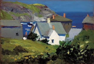
Edward Hopper - American

Monhegan Houses, Maine, c. 1916-1919

The brick chimneys really make this image. Though almost negligible in area, their orange hue contrasts with the predominant blue, green and gray hues, and makes them visually important in unifying the image.