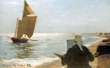
Though loosely representational, the unusual prow-on view of the fishing boat appears almost abstract. Bright colours are combined with scumbled greys to great effect. The linearity of the rigging is carried through to other details of the subject, while the background is left vague. This work reminds us that good painting always has an abstract dimension. While evoking a specific subject, it is also about line, colour, shape and tone. An unusual viewpoint can help bring out the abstract elements of the subject.
Sunday, March 28, 2010
Unusual Viewpoint
Egon Schiele - Austrian, Tieste Fishing Boat.
Though loosely representational, the unusual prow-on view of the fishing boat appears almost abstract. Bright colours are combined with scumbled greys to great effect. The linearity of the rigging is carried through to other details of the subject, while the background is left vague. This work reminds us that good painting always has an abstract dimension. While evoking a specific subject, it is also about line, colour, shape and tone. An unusual viewpoint can help bring out the abstract elements of the subject.
Though loosely representational, the unusual prow-on view of the fishing boat appears almost abstract. Bright colours are combined with scumbled greys to great effect. The linearity of the rigging is carried through to other details of the subject, while the background is left vague. This work reminds us that good painting always has an abstract dimension. While evoking a specific subject, it is also about line, colour, shape and tone. An unusual viewpoint can help bring out the abstract elements of the subject.
Thursday, March 25, 2010
Subtle Tone
This work conveys the impression of the soft light of morning, or evening, through the use of subtle shifts in tonal values; however, there is still suffficient tonal contrast between the darkest and the lightest part of the image to give it strength. This can be seen more easily by digitally sampling the darkest and lightest tones and comparing them. When looking at the scene on site it can be difficult for the eye to read these tonal extremes, as it tends to see the overall picture.


Monday, March 22, 2010
John William Waterhouse - English
Ulysses and the Sirens, 1891
The Mermaid
Waterhouse was the last of the Pre-Raphaelite painters, sometimes called 'the modern Pre-Raphaelite'. His work differs from that of the earlier PR painters as he picked up some of the techniques of the Impressionists, and his brushwork is more painterly. Last year there was a large retrospective exhibition of his work that travelled to galleries in the Netherlands, the UK, and Canada.
Labels:
19th century,
Mermaids,
mystical/mythopoetic,
ships
Colours for Seawater
William Ritschel, The Breakers, California Coast, 16 x 20 inches
detail
detail
detail
detail
The turquois green in the waves looks like a mix of Viridian Green and Phthalo Blue (also called monastral or monestial blue).
Phthalo Blue is a cool blue with a bias towards green, making it suitable for seawater. It has intense tinting strength and easily overpowers the mix when combined with other colours, so use carefully. The very small patches of Viridian in this painting really jump out of the overall grey/white palette. Green and turquois have a yellow (warm) element, that should only be used in foreground water, not in the distance. Warm, saturated colours advance; cool, desaturated colours recede.
Below: Viridian and Phthalo Blue
Below: Viridian and Phthalo Blue
Saturday, March 20, 2010
Wide Format
A wide format crops away superfluous elements. If a painting is about the sea, there's no need for large areas of sky and sand.
Thursday, March 18, 2010
E Phillips Fox - Australian 1865 - 1915
Birthday 12 March
Note the reflection of the white foam in the wave. Also the progression of colour from warm tones in the sand to light emerald and light ultramarine in the nearest wave, to dark blue middle distance, and violet in the distance. To create the impression of recession in space, landscape artists use warm hues in the foreground, and cool, desaturated colours in the background.
Unfortunately this is not a very good reproduction of the painting and doesn't convey the iridescent effect the artist has produced by interweaving strokes of different colours.
Unfortunately this is not a very good reproduction of the painting and doesn't convey the iridescent effect the artist has produced by interweaving strokes of different colours.
Wednesday, March 17, 2010
Johannes Hermanus Koekkoek - Dutch
Sunday, March 14, 2010
Watercolour Sketches
Harold Irving Smith, American, 1892-1969
Painting a moving target, like the sea, is not easy. Some seascape artists like to work from photographs. Personally, I find that, while a camera may capture the detail of that elusive veil of spray, once I look at photos back at home, hours or days later, the inspirational feeling of the moment has been lost. I find it difficult to work from photos, but they are useful as a reference, combined with sketches. Rapid sketches done on location, can be a good way of preparing for an oil seascape. With subjects as transient as a waves and spray, you have to get used to drawing or painting from memory to quite an extent.
This watercolour sketch, looks as if it has been done very quickly yet it captures all the essential elements of the scene/event. With quick sketches, there's no time to get lost in photographic detail. The artist has started with a rapid pencil sketch, drawing as lightly as possible in order to free up the subsequent washes of transparent colour.
For on site seascape studies, pencils and watercolours and a small pad of watercolour paper are more convenient to carry around than canvases and tubes of oil paint. Oil sketch paper can be substituted for bulky canvases. Small tubes, designed to minimise the weight of a plein air paint box, are available in certain brands. Some plein air oil painters, who know in advance the kind of colours they are going to encounter, take a palette with oil colours already squeezed out onto it (presumably covered to stop it drying out) leaving the heavy tubes behind. Some artists even premix the colours they expect to use, but the disadvantage of using premixed colours is that the colours in the environment are always changing. Still, something to consider.
Saturday, March 13, 2010
Distance
Thomas Jacques Somerscales - British 1842-1927, Sail and Steam in Majesty, 84 x 145 cm
The sailing ship is more distant than the steamer, and is therefore painted in less saturated tones and with less detail. The waves nearest to the horizon are also hazier. Adding too much detail to distant objects will bring them forward and look wrong. We can see rigging ropes on the ship but they are only very subtly suggested, perhaps lightly scratched into the paint with a sharp point.
Thursday, March 11, 2010
Randomness
Detail
Waves are usually chaotic in structure. No two are alike. To make them look convincing, brush or knife marks need to be random and varied. However, the direction of the marks should still follow the planes of the water surface, the movement of the wave, the direction of the wind, and the source of light. The white highlights on waves crests are often best done with a painting knife because knives tend to produce a more random effect than brushes. Vary not only the shape but the tone of the highlight marks. Fine marks can be made with the tip of a small knife with a relatively sharp point. Twisting the knife as you trail it lightly across the canvas creates more randomness. While striving for randomness, don't forget to make the marks decrease in size with distance. Highlights are often done in impasto, but three dimensional texture should also decrease with distance. With practice you can create the impression of fine, realistic detail with very rapid passages of knifework.
Tuesday, March 9, 2010
Asymmetry
Frederic Edwin Church - American, Rough Surf, Mount Desert Island
A composition consisting of three main elements (in this case, three areas of rock), often at the vertices of an asymmetrical triangle, is generally more pleasing to the eye than a painting where the eye bounces between just two main elements. Asymmetry is more visually dynamic than symmetry.
Frederic Edwin Church (May 4, 1826 – April 7, 1900) was an American landscape painter born in Hartford, Connecticut. He was a central figure in the Hudson River School of American landscape painters. While committed to the natural sciences, he was "always concerned with including a spiritual dimension in his works".
Frederic Edwin Church (May 4, 1826 – April 7, 1900) was an American landscape painter born in Hartford, Connecticut. He was a central figure in the Hudson River School of American landscape painters. While committed to the natural sciences, he was "always concerned with including a spiritual dimension in his works".
Saturday, March 6, 2010
John Brett - British
Off the Coast of Guernsey, 18 x 35.5 cms
Nice use of purple and yellow complementary colours.
Nice use of purple and yellow complementary colours.
John Brett (1831–1902) was an artist associated with the Pre-Raphaelite movement (although is not considered to be a Pre-Raphaelite painter himself), mainly notable for his highly detailed landscapes. In his later years he painted more coastal subjects and seascapes, subjects he came to know well due to his ownership of a 210 ton schooner, Viking (which had a crew of twelve), on which he travelled the Mediterranean.
Friday, March 5, 2010
Christopher Blossom
After the Last Drift
Placing a figure at the exact centre of a painting can create an almost religious feeling of stillness. Here it adds to the sunset mood of reverie. The figure also acts as a link between the lower and upper halves of the composition.
Thursday, March 4, 2010
Frederick Judd Waugh - American
Pounding Surf ND, 11.5 x 15.75 inches
At his best, F Judd Waugh is one of my favourite seascape artists; for his sense of structure, and his fine observation of the forms of waves, foam and rocks.
I realise that many would look on this type of painting as 'motel art'. This happens when a style of painting deservedly enjoys popularity, but then gets rehashed to death, and later haunts us as a kind of scary kitsch ghost. But if you see FJW's work in it's historical context, forgetting about subsequent imitation, you get a wonderfully clear evocation of the sea. He lived for almost 80 years - his first 40 in the 19th Century and the second half of his life in the 20th - so it's understandable that his work stands somewhat awkwardly between the Victorian and the Modern. Anyway, you'll find a lot of his work in this blog. FJW's reputation in the contemporary art market has not been helped by the sentimental figurative works he also did.
FJW was considered the successor to Winslow Homer as the greatest marine artist of his day in America, but is unlikely to have seen any of the elder artist's work.
He wrote, Painting by the Sea, and Seascape Painting, Step by Step with a Knife, instructional books on painting.
FJW was considered the successor to Winslow Homer as the greatest marine artist of his day in America, but is unlikely to have seen any of the elder artist's work.
He wrote, Painting by the Sea, and Seascape Painting, Step by Step with a Knife, instructional books on painting.
Wednesday, March 3, 2010
Celebrating a Colour
Atlantic Rollers
A painting celebrating the colour white.
The renowned artists of the past often designed their paintings to celebrate a single colour, repeating it throughout the entire composition, and adding only secondary hues and tones that support and complement it. White clouds, give unity and strength to the image. A bright blue sky would have detracted from the wonderful detail in the white foam. Tiny amounts of yellow in the foam bring out the blue in the waves.
It probably seems strange to chose a white painting to illustrate the use of colour, but in oil painting, white and black should always be considered colours. There is no such thing as a neutral or non-colour, every colour is altered by those around it.
Subscribe to:
Posts (Atom)


+Russian+American,+Heavy+Seas,+25+x+30+inches.jpg)


+Sail+and+Steam+in+Majesty,+84+x+145+cm.bmp)

+Near+Folkestone,+12+x20+inches.bmp)


