Thursday, September 26, 2013

Greys


I've been experimenting mixing greys from complementary colors. (If anyone has any other favourite tube greys or mixed greys, please let me know).


The top row consists of tube greys.
The Warm Grey Light shown here is by Old Holland.
The Torrit Grey is a very colourless gray produced by Gamblin from leftover pigments (it varies from batch to batch apparently, depending which pigments are left over).
The Davy's Gray is Winsor and Newton and very transparent. Davy's Gray is useful for darkening bright colors without dirtying them too much. It leans toward green.

The other three rows are greys mixed from complementaries.
In some of the mixes I may not have spent enough time getting the colors to neutralise each other.
The Cad Yellow Deep I used to mix with Ultramarine looked very orange, but was not orange enough and produced a yellow ochre rather than a grey.

Burnt Sienna + Cobalt Blue and Raw Sienna + French Ultramarine look pretty much like Davy's Gray.
Viridian + Quinacridone Rose looks very much like Payne's Grey.
Prussian Blue +Venetian Red is a lovely grey that looks like Indigo.
These mixes could be used as substitutes if you don't have those tube greys.


If the complementary colours are not mixed completely, an interesting vibrant grey is produced.

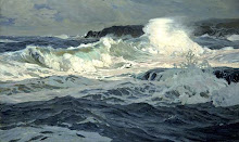
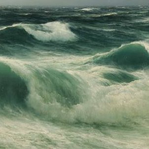
Payne's Grey, Davy's Gray and Indigo, would be useful for marine painting. The mixes of Alizarine or Quinacridone reds with and Viridian or Phthalo Greens, look like useful greys for skies.

If you mix greys from complementary colors that you have already used in other parts of the painting, the effect will be to unify and harmonise the painting.

Thursday, September 12, 2013

Peter Nahum at Leicester Galleries


Frederic Lord Leighton, St Paul’s Bay, Lindos, Rhodes (Greece, 1867).

Julius Olsson, Seascape, England, c. 1920, St Ives School.

Montague Dawson, Full Sail.

leicester galleries

Tuesday, August 20, 2013

Marine Evenings


Albert Goodwin, Sunset.
Arthur B. Davis.
Olof Thunman
Frederick Judd Waugh, Moonlight, 1893.
Pelle Svedlund, Evening on the West Coast (Sweden, c.1891).  


Sunsets provide a way of introducing warm colours: golden yellows and reds, into a marine painting, to balance out the coolness of the sea.

Wednesday, July 24, 2013

Emptiness - Arkhip Kuindzhi


The Russian/Ukrainian painter Arkhip Kuindzhi (1842–1910) grew up on the shores of the Black Sea. He was a master of effects of light, distance and atmosphere. In their near emptiness, his seascapes and landscapes have a meditative, poetic quality.
The use of a warm complementary ground (visible in the wave sketch) gives vibrancy to the cool shades of water and sky painted over it.


Wednesday, July 10, 2013

Impressionism - Ultramarine Blue


Bernhard Gutmann, Breton Fishing Boats, 1912.
Childe Hassam, The Silver Veil and the Golden Gate.
Claude Monet, Rocks at Belle Isle Port Domois.

Though it sometimes seems as though the works of the Impressionist masters have been imitated to death, there is much to learn from them.

The emphasis on capturing effects of light and atmosphere, the unification of the image through colour and pattern, the vibrant optical colour mixing, the energy of the brushstrokes - these things will always be relevant to painting.

As seen in these works, the Impressionists celebrated Ultramarine Blue. They used it for skies, seas, and shadows (unmixed with white, it can be used almost as a black). 
Ultramarine was originally made from ground semi-precious stone (lapis lazuli) imported from far off central Asia. It was prized for its ability to simulate the azure of skies, but it was prohibitively expensive.
In the 19th century, chemists discovered how to make a much cheaper artificial version of the pigment with almost the same beauty and qualities.
The Impressionists also made use of Cobalt Blue and Cerulean Blue (both also first produced in the 1800s). Ultramarine is a favourite mixing blue, as it doesn't overpower the mix.

Artists often wonder what the difference is between "French Ultramarine" and "Ultramarine". French Ultramarine tends to be more violet than blues simply labelled 'Ultramarine'. A violet cast can be useful for painting natural-looking skies.
Dick Blick art supplies, say that the only 'natural' or 'genuine' Ultramarine they stock is DaVinci Lapis Lazuli Geniune, which is produced from stone mined in Chile.


Saturday, June 1, 2013

Lisa Egeli


Florida Morning, 12 x 16 inches
Newtons Laws, 20 x 40 inches
Summer shoreline, Chesapeake Bay, Plein Air, 16 x 29 inches
Images © Lisa Egeli
Lisa Egeli is a landscape and portrait painter based in Maryland.
I love the combination of painterliness and clarity in these shore scenes.

lisaegeli.com

Saturday, April 27, 2013

Georges Lacombe


Marine bleue, Effet de vague

The Cliffs At Camaret, c.1892


A member of the Post-Impressionist group known as Les Nabis (the Prophets), Lacombe is better known as a sculptor. The Nabis emulated Gauguin, and sought to strengthen line, form  and design, things sometimes overly dissolved by the Impressionists.
The group were fond of the fields and coast of Brittany.
The influence of Japanese prints is obvious in Cliffs at Camaret, in particular.