Thursday, December 31, 2009

Winslow Homer


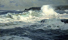
This is a watercolour not an oil painting, but it's a good example of a simple and pleasingly balanced composition in a square. The square format helps to create a sense of restfulness. Homer has made a strong punchy image through the use of a wide tonal range from black to white, but there is also lots of interesting subtlety in the sky and shadows for the eye to lose itself in.

Happy New Year!


Jeffrey Larson,
16 x 12 inches


Those inexperienced with tonal painting, would probably be afraid to use the very dark tones seen in the figures (the arms and shadows in the blond hair are almost black)  but they are critical to producing, through contrast, the effect of brilliant light reflecting off the foam.
It's a useful exercise to look at the different tones in an image in isolation from each other. You'll be surprisied, maybe even shocked, at how much darker or lighter the isolated tones really are compared to their appearance in the whole image. You can use a piece of opaque paper with a small hole in it, or, with digital images, use the eye-dropper tool in PhotoShop to sample tones and hues.

Tuesday, December 29, 2009

Kim English


I like the concise and energetic brushwork in this piece.

Sunday, December 27, 2009

John Singer Sargent - American


Low Tide at Cancale Harbour


The Derelict


Sargent has found an interesting viewpoint for the top painting. The arrow shape of the harbour wall is unusually dynamic, threatening to lead the eye out of the composition, but the other objects draw it back in.

In The Derelict, the placement of the ship on the right of the image intuitively feels right. The eye of the viewer tends to read a painting from left to right. Objects on the right give a sense of the passing of time and tranquility (which suits the subject - a derelict boat) whereas a single object on the left can evoke a more abrupt or violent mood.

Saturday, December 19, 2009

Winslow Homer - American


Watching the Breaker


Another example of strong tonal contrast producing a sense of drama appropriate to the subject of the work. White spray behind dark figures is a favourite device of seascape painters. The small area of dark rock on the left balances the dark on the right. Snow-covered rocks contribute to the contrast.

Sunday, December 13, 2009

Saturday, December 12, 2009

Ferdinand Keller - German


 Italian Landscape


This may be a marine scene, or the shore of a lake. Dark conifers provide a strong tonal contrast to the white clouds and foam.

William Ritschel - German American 1864-1949


Foaming Surf 26 x 30 inches

Tuesday, December 8, 2009

Newell Convers Wyeth - American


Robinson Crusoe
cover illustration, oil, 80 x 76.2 cm


The strong tonal contrast between the figure's dark coat and the white spray behind, increases impact.

Monday, December 7, 2009

Joaquin Sorolla - Spanish

Barcas en la Playa,
22 x 37 inches


The lively dance of Sorolla's brush gives  his paintings their spirit and energy. The only way to get this kind of confident fluency is to spend a lot of time painting. Sorolla seems to have been very prolific in his output.

Tuesday, December 1, 2009

Edward Moran


Off Calais Pier


 As a general principle, diagonal lines that lean in towards the centre of the image are considered better compositionally. Outward leaning lines tend to lead the eye out of the frame of the image, lessening its visual gravity. 
The lines of the mast, horizon, boat's wake, and the edge of the sail of the rear boat, converge on a group of figures, creating a focus of interest.