Tuesday, December 28, 2010

Underwater Marine


Four Leaping Sailfish and Halfbeak, 24 x 43 inches.
Bonefish, Four Bones up with the Tide.


Another sub-genre of marine art is the underwater marine.  
The American artist and illustrator Stanley Meltzoff (1917-2006) was a master of this type of scene, skillfully combining wild-life painting and underwater seascape. He was probably the originator of this genre.

Stanley Meltzoff - Picture Maker


stanleymeltzoff.com

Saturday, December 25, 2010

Women On Deck


Emanuel Phillips Fox, Australian, The Ferry.
Julius LeBlanc Stewart, American, On the Yacht Namouna, Venice. 
Raoul Du Gardier, White Calm, Telfair Museum.

This is a kind of sub-genre of nautical painting that seems to have been popular in the late 19th century and early 20th century. It had plenty of scope for interesting compositions combining figures, cloth, linear elements (both curving and straight) and seascape.

Sunday, December 19, 2010

A Peaceful Christmas

James Tissot, Christ Asleep During the Storm
Not sure of the medium here. Could be gouache or watercolor, or a combination.


Tissot (French, 1836–1902) is best known for his depictions of fashionable Parisian women (as in the centre image: HMAS Culcutta, painted in 1877, which looks like an oil), but in his later years he turned to illustrating scenes from the Old and New Testament.


The Hull of a Battle Ship (bottom image) definitely looks like an oil.

Monday, December 13, 2010

Decisive Brushstrokes

These plein air studies, by David Simons, work well because the artist has chosen subjects which are simple yet contain interesting shapes and relationships.
Good plein air painting is characterised by decisive brushstrokes - as few as possible to convey the scene - varied to produce interesting patterns. Brushstrokes should follow the form of an object.
Both studies are 16 x 20 inches.


Wednesday, December 8, 2010

Sunday, December 5, 2010

Bird's Eye View


The Golden Rose, oil on paper on panel, 2007, 36 x 3ft 12 inches


Farseekers - Journey, oil on paper mounted on masonite, 27 x 32 inches


These illustrations by the New York based artist, Donato Giancola, are striking in their use of aerial perspectives. Though the works are quite large, Giancola has chosen paper mounted on panel for his support. 
When working in fine detail, paper is a good option as it provides a smooth surface unobtainable with canvas without lots of priming, sanded between coats. Paper, however, needs to be mounted on a panel or canvas support, with an archival glue, to prevent buckling and damage. 

Artist's website


Sunday, November 28, 2010

Nacreous Color

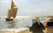
 Top: 15.5 x 39.5 inches 

The Circle of the Sea


The American painter (Thomas) Alexander Harrison 1853 - 1930, was best known for his marines. In The Circle of the Sea, he has captured the nacreous (pearly) effect of evening light.

Harrison rented a ramshackle cottage near the Brittany town of Beg-Meil, and each evening raced to the dunes to watch the sun set over the ocean. In late-summer 1896, he was joined there by struggling writer Marcel Proust and composer Reynaldo Hahn. He opened their eyes to how light plays on water:

"We have seen the sea successively turn blood red, purple, nacreous with silver, gold, white, emerald green, and yesterday we were dazzled by an entirely pink sea specked with blue sails."

Hahn is considered the inspiration for the title character in Proust's attempted first novel Jean Santeuil, but another character, "C", seems to be based on Harrison, along with aspects of the character Elstir, the painter in Remembrance of Things Past.

His brother, L. Birge Harrison (1854 -1929), also a painter, particularly successful in snow scenes, was a pupil of the École des Beaux Arts, Paris, under Cabanel and Carolus-Duran. Another brother, Butler Harrison (d. 1886), was a figure painter.

Tuesday, November 23, 2010

Movement

Edgard Pieter Jozef Farasyn, 1858-1938, 28 x 43 cm


Painterliness in the waves and sky, contrasted to the crisp fine detail of the fishing boats, gives a sense of movement.
Though the brushstrokes in the waves are painterly, they conform to the planes of the waves.

Friday, November 19, 2010

Academic Art

William Bouguereau, L'orage (The Storm)


This is not technically a marine painting but it is suffused by a marine atmosphere.

Ideology

Lately I have become increasingly aware of certain ideological disputes within the art world. Whenever ideology creeps in - whether left-wing or right-wing - painting suffers. The main divide is between conservatives and progressives. In the complex world of art movements conservatives have become at times radical reactionaries, while progressive artists have sometimes re-explored the painting of the nineteenth century from a slightly ironic viewpoint.
I have an admiration for the technical skills of the nineteenth century painters, but recognize that much of the work from that period is sentimental, superficial and even kitsch, or born out of attitudes no longer tenable today, such as Imperialism and Eurocentrism. As with any period of art, much of it is just mediocre. At the same time, I think a lot of people look at a quality Victorian painting and automatically see something tainted by Imperialism, sexism or some other oppressive ideology of the past, without really pausing to consider it as paint applied to canvas. 
There are a lot of nineteenth century works on this blog, but the intention is not to take a conservative, anti-modernist stance, as the Art Renewal Centre has done. The reason there is so much nineteenth century art  posted is that I feel there is a lot that can be learnt about image-making, from that period.
There are works from the modern movement also represented here, but it's pretty obvious that the  golden age of the seascape was the 19th Century. However, there are many contemporary artists turning to the genre from a fresh angle, and I seek to include their work whenever possible.

For further reading on this topic I recommend this open letter to the ARC by the artist Mark Vallen

The academic Artist William Bouguereau, foe of the Impressionists, is one of the ARC's heroes, though they do, perhaps reluctantly, include some Impressionist work on their site.
This is a contemporary reworking of one of his marines, La Vague, by the Worth 1000 vandals :).


Thursday, November 11, 2010

Jamie Wyeth

Top: The Sea, Watched, oil on canvas, 30 x 48 inches.
Bottom: The Rookery


American painter, Jamie Wyeth, is the third generation of artists in the Wyeth family.

Friday, November 5, 2010

Dramatic Lighting


Source: J Russell Jinishian Gallery
Russ Kramer, The Wizard and the Queen
Donald Demers, Sunrise at Sea
Christopher Blossom, Silhouette

Sunday, October 31, 2010

The Tao of Composition

Lands End, San Francisco, 13 x 16 inches


In this piece by the American landscape painter, Raymond Dabb Yelland, the rocky foreground is roughly equal in area to the muted tones of the background sea and sky, forming a kind of Yin Yang composition. The small rock in the waves on the left helps marry the two halves. It's always good to add a little of the Yin in the Yang, and vice versa.

Monday, October 25, 2010

Frederick Judd Waugh

Here's a link to a great post on the painting notes of F. Judd Waugh, the great master of surf painting: art and influence blog.

His seascape palette included three blues: cobalt, ultramarine, and cerulean. Viridian green combined with cerulean blue produces the turquoises in his foreground waves. Cerulean and viridian are essential for capturing the hues of seawater. He added the cool red, Alizarin crimson, to his skies to suggest distant rosiness. He also included cadmium red and yellow in his palette, warm colors suitable for foreground rocks and sand; and burnt and raw sienna would have served for underpainting cliffs and rocks. Sea foam needs to be a bright and opaque white. He used "permalba" white and ivory black (a cool black tending towards blue, suitable for the sea).
I'm not sure what was in the permalba white manufactured in the early 20th century but on a painting forum I read that the permalba white in art shops today is not very opaque.

Some books on F. Judd Waugh:

More poetry

Frits Thaulow, Solitude, Christiana Fjord


Frits Thaulow (1847 - 1906) was a Norwegian impressionist painter. The best Impressionists, including Monet, often made use of punchy tonal contrasts, and used black, though there is a misconception that they completely avoided it and only used pastel shades.

Monday, October 18, 2010

Edward Moran 1829-1901


Top: Shipwrecked
Bottom: Sailing in Rough Seas


Edward Moran's works invoke a poetic mood. Something to aim for in painting any subject.

In Shipwrecked, the white lighthouse represents hope, and is contrasted to the dark waves on the left.
Moran sets off the lighthouse, and the white waves breaking on it, by placing an area of grey rain behind.

Marine Paintings: Edward Moran- Masterpainter (Volume 1)

Tuesday, October 12, 2010

Joaquin Sorolla y Bastida


The energy of the brushwork recalls the work of Van Gogh. The orange and blue areas intensify each other.

Friday, October 8, 2010

Montague Dawson


These are two images of Dawson's The Fleet Messenger, found on different websites. They demonstrate that reproductions can differ greatly from the original, and each other.


Thanks to the blog underpaintings for originally posting this work.

Monday, October 4, 2010

Another Newlyn School Artist

Mary McCrossan, Wind and Surf.


There are often purple/violet shades to be seen in the wet beach.

Thursday, September 30, 2010

Line

Harold Knight, English, Harvesting the Sea
Source: newlyn school painters blog

Sunday, September 19, 2010

Schooners

The three masted schooner "Atlantic" at the start of the Transatlantic Race, May 17th 1905

A wonderful example of contemporary marine painting by the New Zealander AD Blake.