Thursday, December 15, 2011

Love Interest


Emile Friant, Alone
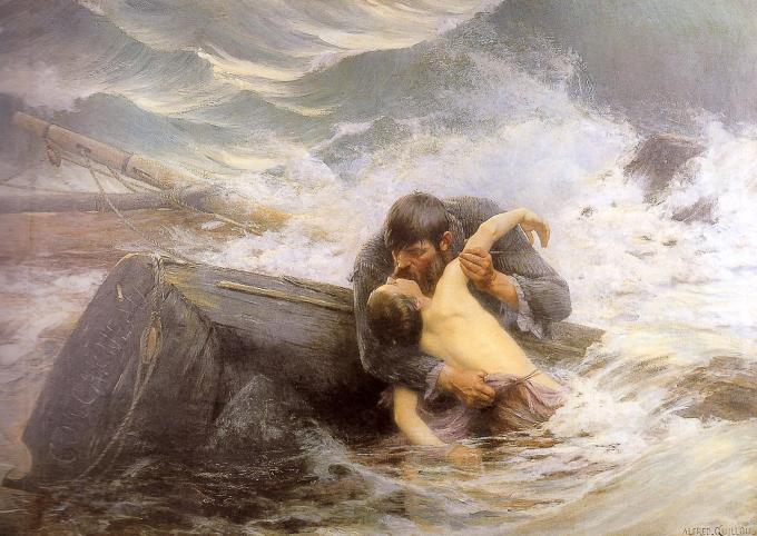
Alfred Guillou. Farewell
Rowland Wheelwright, The Enchanted Shore

William Stanley Haseltine


Nice use of verticals vs horizontals in these works.

Saturday, December 3, 2011

Michael Zeno-Diemer


The German maritime artist Zeno Diemer (who died in 1939) was not afraid to use strong contrasts. His paintings have that typical German precision but are in no way lacking in energy. He is a favourite of mine whose work I've posted before.


The use of a warm colour (red in the ships) acts as a foil to the the cool colours in the waves. Golden yellow in the sky contrasts with the Prussian or Cobalt Blue waves.

Sunday, November 13, 2011

Martine Emdur

Sea Weave V, 183 x 167 cm

Martine Emdur is a successful Australian artist whose work has been posted here before. She works on a large scale, and this prompts me to add to comments I have made previously about scale in painting.
On of the realities of the art market is that large scale works are often favoured by galleries dealing in contemporary works, not only because the price (and therefore the commission) is usually higher, but because they suggest an artist who has confidence and maturity, and who is established to the point where their work is being hung in large gallery spaces. 
Also, wealthy clients, or their interior designers, look for large pieces that are not lost on the vast wall areas of office building foyers, board rooms, or upper-end-of-the-market living rooms.
As I've said before: there is a correct scale for every subject, and big is not always better, but vastness certainly does give impact, and can make people stop and really look at something that they may not have noticed before. This was an observation made by Georgia O'Keeffe - she wanted busy city people to pause and see what she saw in the intimate and timeless world of flowers, so she painted them on a vast scale.


Her recent paintings of water have struck a chord with the public: people are willing to wait two years to buy one.
Gallery director Ali Yeldham, suggests Emdur's work is so popular because everyone can relate to water. 
"Her work is very therapeutic," says Yeldham. "It evokes calmness, a stillness. When the gallery is hung with her paintings it becomes soothing and tranquil. After September 11, we found people would come in just to be around them, to seek some solace. They have that effect." 
Even though artists have always painted water, Emdur has developed a unique way of rendering liquid landscapes.
"They were captivating images. I knew there was something very special about them," says Yeldham. "Martine's paintings evoke the memories of childhood, of past experiences so many of us have had at the seaside, in that place."
Her shows have moved away from the figurative and have become more about the water itself. The refracted light. The movement.
"It's just water. No peripherals. I've spent a really long time trying to learn about how it all flows and how to paint it. The patterns. The flow, the light going through it. The circles of light in the water. It's hard to describe.


Friday, October 28, 2011

Peter Graham


In his depictions of rugged coastlines, the Scottish Painter Peter Graham (1836-1921) made use of strong contrasts between fine detail and expressive brushstrokes, and between white spray and dark rocks. He usually added seabirds which served to integrate these contrasting elements in the composition. he worked on a large scale, to convey the awesome grandeur of his settings.

Friday, October 14, 2011

Pocock Fine Art Gallery


Some marine works from Pocock Fine Art, Fort Lauderdale, Florida.

Gordon Hope Grant, Down-Easter.
Louis Gabriel Eugene Isabey, The Approaching Storm.
Emile Gruppe.
Fiona Pocock Corn.

Sunday, October 9, 2011

Claybord Panels

Recently I was looking at the website of the artist/illustrator Kinuko Y Craft, who likes to work on a small scale with very fine detail (often using 00 size brushes). She mentioned that she uses Claybord pre-prepared panels as her support. Made by Ampersand, they have a very smooth surface, making them suitable for miniatures and fine work. The clay provides an absorbent surface that takes paint well.

If your aim is to produce a hyper-real image, you don't want a textured support that draws attention to to the surface and destroys the illusion of depth. But for plein air work, surface textures such as the brush marks of un-sanded priming, can add interest, energy, and a kind of honesty.


To get this level of smoothness with home-prepared supports would take a lot of sanding of multiple coats of primer or gesso, waiting for each coat to dry. Some might find the surface too smooth for their style of painting. I have yet to try them myself. Would welcome comments from those who have. 

The panels, which are supposedly more archival than masonite, are also made with a box-like cradle suitable for hanging unframed (you might have to clean up the edges for presentability if you are a messy painter). The sides are also paintable. They are not cheap, but if you don't want to spend time preparing panels, they might be a good option, and you can save on framing costs if you use the deep cradled panels and hang them unframed for a clean, modern look. 
The thin un-boxed panels would be the most convenient for plein air trips. Plein air painters often use slotted boxes to separate wet panels during transportation.

Monday, October 3, 2011

William Trost Richards

detail


The slightly pink sky, probably of early morning, sets off the emerald hues in the waves - a  color scheme the American marine painter, Trost Richards, used many times. The sky color is brought into the troughs of the waves where they reflect it.

Sunday, September 25, 2011

Louise Britton


Louise Britton is an artist living in Seattle, Washington. She spends part of each year on Edisto Island, South Carolina, in a small cabin on land that has been in her family for generations. Her work has a dreamlike quality, though traditionally rendered in meticulously realist technique.
These fine works remind me a little of Magritte, though they are not overtly surrealist.

Tuesday, September 13, 2011

Victorian Kids and the Sea


Alma-Tadema, The Inundation of the Biesbosch in 1421.
Sir Edward Poynter 1836-1919, Outward Bound, Tate Gallery.


Sir John Everett Millais, 1829-1896, The Boyhood of Raleigh.
Charles W Nicholls.

Thursday, September 1, 2011

James Perry Wilson


The American painter James P Wilson (1889-1976) is best known for the diorama paintings he produced for natural history museums. 
To help him create the illusion of reality he thought about light and atmosphere in scientific terms.
The art and illustration blog Gurney's Journey has an interesting post on his technique and theory.


Friday, August 26, 2011

Atmosphere


This depiction of a rocky coast in moonlight, by an unknown Russian artist, is in the tradition of romantic painters such as Aivazovsky. Not only is it full of drama and mystery, but it's beautifully composed.

Wednesday, August 17, 2011

Paul von Spaun


The German or Austrian painter Paul von Spaun (1876-1932) is known for his depictions of the coastline of the Italian island of Capri, where he lived for many years.

Sunday, August 7, 2011

Edward Seago

Edward Seago (1910-1974), Storm at Sea 1956-7.
I think this is one of a series of sketches the artist made from the deck of a ship visiting the Antarctic. An iceberg is visible on the horizon.

Thursday, July 21, 2011

The Quality of Mystery

Oswald Achenbach, Fishermen


The two light sources in this 19th century work are the moon and a torch held by one of the fishermen. The warm light of the torch helps bring the foreground of the scene forward, while the cool, silver lunar light, filtered through the smoke of a smouldering volcano (Vesuvius perhaps), makes the background recede. 
The artist has chosen to conceal both these light sources, imbuing the painting with an engaging sense of mystery; a quality that seems to have been aimed for in the 19th century but is often neglected in these days of sound bites and instant information.
The equilibrium of a square format helps create a mood of tranquility.

Achenbach (2 February 1827 – 1 February 1905) was a German landscape painter. Born in DĂĽsseldorf, he received his art education from his brother, Andreas Achenbach. His landscapes generally dwell on the rich and glowing effects of color which drew him to the Bay of Naples and the neighborhood of Rome.

Sunday, July 10, 2011

Diane Mannion

Gulfscape #1, 6 x 6 inches.

This delightful wave study is by the Florida-based artist Diane Mannion.
Read her notes on painting the Gulf of Mexico, on her blog

Friday, July 8, 2011

Joyce Pekala

The strength of this image lies in it's simplicity, the unusual viewpoint and the strong contrast between the cool blue shadow and the warm beach.

Friday, July 1, 2011

Reflections


These are watercolors, not oils, and wonderful ones at that, by the American master watercolorist, Steve Hanks.

Reflections are an important means of evoking the water element and the marine environment.

“The ocean made a strong and lasting impression on me. It was good for the soul to be out in the water—surfing, swimming, or simply getting in touch with its mysterious power.”
-From Steve's website

Tuesday, June 21, 2011

Painting from Field Sketches

Vardøhus festning, ca 1870


Norwegian painter, Peder Balke (November 4, 1804 – 1887), hiked around his native Norway, sketching the landscape; later using the sketches as the basis for studio oil paintings, in a romantic style.
This was the way landscape painters worked at that time. In any case, the inclemency of the Scandinavian climate would not have lent itself to completing works on site for most of the year.
Plein air painting is more the norm these days, but there are some  advantages to developing paintings from field sketches: the finished work  tends to be less literal and more 'essential'. The artist has to rely more on memory, which may infuse the painting with greater emotional depth. We tend to remember the essence of a place, rather than details. Also, it's difficult to complete large canvases on site.