
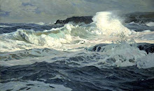
12 x 25 inches
Bricher liked to use a wide format. The balancing of visual weight in left and right halves of the composition becomes more vital in wider formats. Here Bricher has used the dark shadow of the breaker, and the two boats, as a counterweight to the cliff. When painting long linear elements, such as the long waves and shoreline, its generally advisable to avoid placing them so that the lines become paths leading the viewer's eye right into a corner. Corner vectors draw the eye to the frame and out of the image. The aim of good composition is to captivate the interest of the viewer within the painting. Most artists intuitively avoid this mistake, but it's good to be consciously aware of how the linear elements in a scene can be used to act as pathways for the viewers eye between points of interest. In the Bricher's piece, a line of white breaking water links two points of interest: the larger boat on the left and wave splashing up the cliff on the right. The two points are positioned roughly at golden mean sweet spots, which increases their visual weight.


No comments:
Post a Comment