Tuesday, November 16, 2010

Thursday, November 11, 2010

Jamie Wyeth

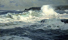
Top: The Sea, Watched, oil on canvas, 30 x 48 inches.
Bottom: The Rookery


American painter, Jamie Wyeth, is the third generation of artists in the Wyeth family.

Friday, November 5, 2010

Dramatic Lighting


Source: J Russell Jinishian Gallery
Russ Kramer, The Wizard and the Queen
Donald Demers, Sunrise at Sea
Christopher Blossom, Silhouette

Sunday, October 31, 2010

The Tao of Composition

Lands End, San Francisco, 13 x 16 inches


In this piece by the American landscape painter, Raymond Dabb Yelland, the rocky foreground is roughly equal in area to the muted tones of the background sea and sky, forming a kind of Yin Yang composition. The small rock in the waves on the left helps marry the two halves. It's always good to add a little of the Yin in the Yang, and vice versa.

Monday, October 25, 2010

Frederick Judd Waugh

Here's a link to a great post on the painting notes of F. Judd Waugh, the great master of surf painting: art and influence blog.

His seascape palette included three blues: cobalt, ultramarine, and cerulean. Viridian green combined with cerulean blue produces the turquoises in his foreground waves. Cerulean and viridian are essential for capturing the hues of seawater. He added the cool red, Alizarin crimson, to his skies to suggest distant rosiness. He also included cadmium red and yellow in his palette, warm colors suitable for foreground rocks and sand; and burnt and raw sienna would have served for underpainting cliffs and rocks. Sea foam needs to be a bright and opaque white. He used "permalba" white and ivory black (a cool black tending towards blue, suitable for the sea).
I'm not sure what was in the permalba white manufactured in the early 20th century but on a painting forum I read that the permalba white in art shops today is not very opaque.

Some books on F. Judd Waugh:

More poetry

Frits Thaulow, Solitude, Christiana Fjord


Frits Thaulow (1847 - 1906) was a Norwegian impressionist painter. The best Impressionists, including Monet, often made use of punchy tonal contrasts, and used black, though there is a misconception that they completely avoided it and only used pastel shades.

Monday, October 18, 2010

Edward Moran 1829-1901


Top: Shipwrecked
Bottom: Sailing in Rough Seas


Edward Moran's works invoke a poetic mood. Something to aim for in painting any subject.

In Shipwrecked, the white lighthouse represents hope, and is contrasted to the dark waves on the left.
Moran sets off the lighthouse, and the white waves breaking on it, by placing an area of grey rain behind.

Marine Paintings: Edward Moran- Masterpainter (Volume 1)