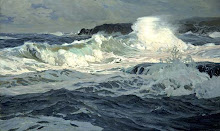
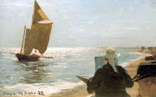
detail
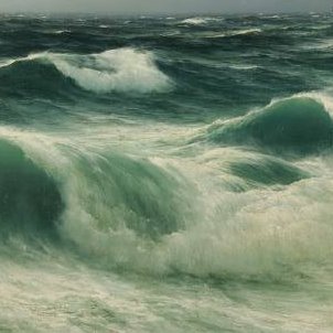
detail
The turquois green in the waves looks like a mix of Viridian Green and Phthalo Blue (also called monastral or monestial blue).
Phthalo Blue is a cool blue with a bias towards green, making it suitable for seawater. It has intense tinting strength and easily overpowers the mix when combined with other colours, so use carefully. The very small patches of Viridian in this painting really jump out of the overall grey/white palette. Green and turquois have a yellow (warm) element, that should only be used in foreground water, not in the distance. Warm, saturated colours advance; cool, desaturated colours recede.
Below: Viridian and Phthalo Blue
Below: Viridian and Phthalo Blue


No comments:
Post a Comment